X’ed Out & Johnny 23
Reviewed by Peter Campbell 17-Nov-10
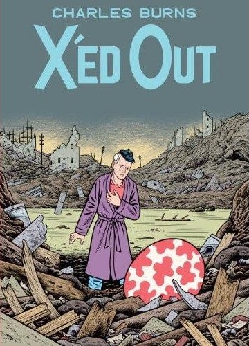
The cover of X’ed Out tells us immediately about the world that we’re going enter. We’re in a razed, post-apocalyptic landscape. Doug, one of the comic’s two main characters, stands before a mottled, oversized red and white egg. It’s a typical Burns scenario, but at the same time it’s a clear hommage to Tintin.
The cover of X’ed Out tells us immediately about the world that we’re going enter. We’re in a razed, post-apocalyptic landscape. Doug, one of the comic’s two main characters, stands before a mottled, oversized red and white egg. It’s a typical Burns scenario, but at the same time it’s a clear hommage to Tintin and specifically the cover of The Shooting Star.
Inside, we’re presented with twin narratives. In one, a Tintin-like character wakes up and is drawn by a vision of his dead cat through a hole that has appeared in his wall. He’s led into a world that resembles a mutated version of Morocco, occupied by grotesque, alien figures.
The other storyline is set in the punk era of the 1970s, and features Doug, a typically mixed-up, slightly alienated character. He’s first introduced waking up in bed, and is shown to have a large bandage plastered to the side of his head. He’s counting out tablets and the days on his calendar. The origin of the wound is left undetermined – it may be an injury, or it may be a brain tumour.
The rest of his story is told in flashback. There’s an embarrassing moment where he’s the opening act at a punk concert in which he reads out very bad, sub William Burroughs cut-ups while wearing a Tintin mask. He meets a girl who he’s clearly attracted to and who appears to have self-destructive tendencies. We see his father who is dying of cancer.
Both narratives are mirror images of each other. The Doug storyline moves back in time. The story of the Tintin-like character moves forward in time. There are common images that feature in both – eggs, foetuses, death, running blood and water, so that the two tales slip and slide into each other.
Some of this is old ground. The Doug sections are classic Burns, with liberal use of blacks. The Tintin sections on the other hand are, appropriately, a partial appropriation of Herge’s style, and rely heavily on their use of colour. They’re surreal where the Doug sections are grounded, wryly humorous in comparison to the teenage angst of the rest of the comic.
In tone it reminds me most often of Daniel Clowes Like a Velvet Glove Cast in Iron, which is similarly open-ended, and equally dreamlike. Where Burns scores over that particular book – and indeed over his own previous work – is that X’ed Out has heart. It has none of the slightly campy, knowing tone that featured in his early stories, and none of the emotional numbness that was the defining tone of Black Hole. In that respect it’s a giant step forward for him.
Rave reviews are somewhat boring but in this case necessary – X’ed Out is easily the best comic I’ve read this year, and we’re living in an age when ambitious, ground-breaking comics are hardly in short supply. Unreservedly recommended.
 Johnny 23
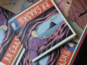
This is a real curiosity: a limited-edition, reformatted version of X’ed Out. It’s hand printed, with silkscreened covers, in black and white. And it’s entirely in an invented language.
X’ed Out is already Burns’ most out-there work, but this takes it to an entirely new plane.
So what does this new edition offer? On a superficial level, it’s very beautiful to look at. A great deal of love and care has gone into its creation. More significantly, it’s been restructured into a two-tier format, as opposed to the three-tier format of the original. Scenes have been recut so that they appear in a radically different order (the final scene is excised altogether, replaced by a different full-page panel).
Almost inevitably, it becomes a much more visual experience. Without the distraction of words, your eye is drawn to the way that images flow into and echo each other: those strangely sexual-looking openings in walls and rocks, the running of blood and water, the succession of bewildered, often numbed-looking faces. And as attractive as Burns’ work is in colour, it’s more compelling in black and white.
Along the way, something strange happens. Your mind starts discarding the events of the original graphic novel and begins inventing new scenarios. Is everything shown one long fever dream? Are the two main characters dreaming about each other? Is that man, the father figure in X’ed Out, simply an older version of one of the central characters? Are you looking at the final thoughts of someone as he commits suicide? It becomes an intense and otherworldly experience, even more so than the original. The price paid though is that the emotional variety of the original is lost somewhere along the way.
This is hardly an essential purchase, but it is an interesting and visually arresting experiment. It’s available from Lederniercri (and the first 500 copies include an additional silkscreen print as an added incentive).
Tags: Charles Burns, Pantheon
Not to compete with Peter’s excellent review, but since I wrote one and sent it in a day too late, I suppose this is as good a place to drop it in as I can think of. It’ll give a slightly alternate view of the book, rather like the concurrent parallels in the book itself:
Charles Burns: X’ed Out
Pantheon, 2010
The first of projected three volumes, it’s difficult to say whether X’ed Out will be a sustained masterpiece on the level of Black Hole. Yet based on the evidence on display here, there is no denying that Burns’ work remains brilliant.
Charles Burns has been working almost exclusively in bold black and white throughout his career. I had apprehensions about X’ed Out soon as I heard it was being published in color. It seemed like a concession to market pressures, a desire to make his work more accessible and less creepy. The funny thing is that the addition of color has made the work more inherently perverse: by dealing with material as peculiar, nightmarish and idiosyncratic as this, the addition of a wide, calming range of colors makes it actually more shocking. His linework remains the same as before, though for obvious reasons there are less filled-in blacks which allows the art room to breathe.
It is almost pointless to talk about the story at this point. A student named Doug is taking drugs after he has had an ‘incident’, and appears to be nodding off into another dream-reality. In the ‘real’ world, he performs William S. Burroughs influenced cut-up poetry wearing a Tintin-like mask, under the aliases NitNit and Johnny 23. He is breaking up with his girlfriend while taking up a possibly unhealthy interest in another student named Sarah, who has a violent — but as yet unseen — boyfriend. In his dreams Doug looks like Tintin without a mask. He follows his cat Inky through a hole in the wall into a nightmarish reality reminiscent of Burroughs’ Interzone: an Algiers lookalike Casbah co-inhabited by various nonhuman creatures, sad edible grubworms, and a large population of men and women of apparent normalcy. These two realities interact and parallel each other in various ways, with the same characters reappearing in slightly different guises, though by the end of the story one is left wondering whether one of the characters has crossed over to the dreamland wearing a mask.
My only minor complaint with X’ed Out is the occasional and admittedly subtle use of Photoshop. It gives the book some dimension alongside the color, but it always draws my eye to it. If it helps Burns work his meticulous art with a faster pace, I can certainly live with it, and it’s probably unnoticeable to anybody who doesn’t work with the software on a daily basis. The handsomely designed hardcover book is also a bit pricey. I’m undoubtedly going to get these titles as they are published, and you’ll have to pry them from my cold, dead hands, in order to get my copies. But should you be on a tight budget, there is the option of hoping for a collected paperback edition in a few years’ time.
The first volume of X’ed Out is as good as anything Burns has done to date, and the addition of color has the potential to subvert a much larger audience. Whether it can be sustained and resolved in a satisfactory manner is still open to debate, but personally I can NOT wait for the follow-up books.
You’re spot on about the Interzone comparisons, JT – I read an interview with Burns where he says that he deliberately filled that section of the comic full of Burroughs references. Alas, that same interview also states he expects a gap of at least a couple of years between volumes.
Groan… couple of years? I recant my Photoshop comment. I like the Clowes comparison – I thought of GIlbert Hernandez’s Sloth while reading it. Would make a good triple-bill.
Remember where you saw that interview?
This is the interview here:
http://www.comicbookresources.com/?id=28938&page=article
It reminded me of Sloth as well, incidentally – you wonder how many of these creators feed off each other, and how much of it is just picking up ideas that are in the air.