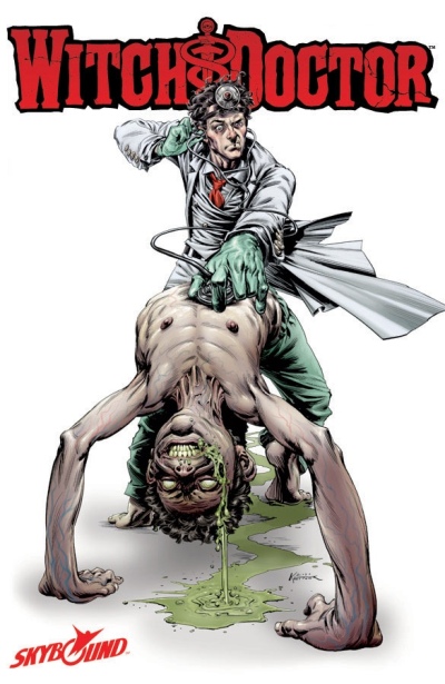
Witchdoctor 1
Reviewed by Martin Skidmore 11-Jul-11
Our hero here is a mystical doctor, taking a pseudomedical approach to the supernatural, here dealing with the traditional possessed kid. He wears a white coat and talks about parasitical infection by demons, and comes accompanied by a paramedic and some sort of weird anaesthesiologist, a mystical girl.
Our hero here is a mystical doctor, taking a pseudomedical approach to the supernatural, here dealing with the traditional possessed kid. He wears a white coat and talks about parasitical infection by demons, and comes accompanied by a paramedic and some sort of weird anaesthesiologist, a mystical girl.
This opening issue is exceptionally heavy on exposition, giving us the magical system we’re in and the lead’s attitude and approach to same, introducing a few characters and giving us a bit of aggravation with the demons. It doesn’t leave much room to establish any sort of story, and my impression is that this issue doesn’t tell us what the rest of the four issues will contain, which is surprising in a mini-series. A text page tries to create some enthusiasm, but the mention of Lovecraftian influences bores me, so doesn’t increase my optimism.
But at least it is a reasonably fresh approach to the supernatural, and the lead character has enough spikiness (though it strains for wit without total success) to offer some promise, so I shouldn’t be too negative about the setup here, and maybe he will even freshen old Lovecraftian ideas a touch.
I’m less keen on the art. I guess Ketner is looking for kind of Wrightson and Bissette styles and touches, but I think his judgement is way off in loads of ways. A lot of the layouts look thoughtless, going into rather simple grid format when weird things are happening. I thought the ‘camera position’ was ill-judged in loads of key places, where we needed a longer view rather than yet another medium shot in a series of same. I struggled to decode some panels too, especially those featuring demonic creatures or mystical energies. Perhaps worse still, the drawing is rather clumsy and ugly, and the colouring too muddy.
I guess there is always a market for horror, and maybe horror comics should look kind of ugly, but I’m not at all convinced that there are enough virtues here to find much of an audience or make for a really good comic.
Tags: Brandon Siefert, Image, Lukas Ketner, Witchdoctor