The Intrepids 1
Reviewed by Martin Skidmore 10-Mar-11
I’ve moaned a lot recently about comics devoid of inspiration or vitality. This looked to have a decent idea, and I liked the look of the style a lot. I was quite hopeful that it would be enjoyable. I am now very disappointed.
I’ve moaned a lot recently about comics devoid of inspiration or vitality. This looked to have a decent idea, and I liked the look of the style a lot. I was quite hopeful that it would be enjoyable. I am now very disappointed.
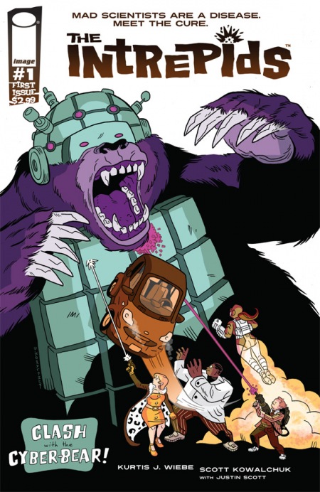
The idea is okay – a scientist recruits and enhances kids to help him combat the world’s mad scientists. Trouble is, the enhancements are as dull as dishwater – one is smart, one strong, one flies with a jet-pack, the last is a dead-shot. It’s hard to believe anyone would come up with such a vanilla set of abilities – is there some satirical intent here that I am missing? I hope there is a twist planned for the setup, since as it stands it’s simpleminded. I imagine the fact that the kids are stealing the research for their boss might imply a darker secret motive in his work, but the kids clearly have given this possibility no thought. The combat here is against some armed stooges plus a cyberbear, which fortunately has exposed antennae that obviously control it, an easy target for our markswoman. No sign of the evil scientist, no sign of them stealing his work, except they have it in later scenes, somehow.
But at least the art has a wacky, old-fashioned charm, right? I did indeed find the cartoony style appealing – unfortunately a ton of other things about the art are very bad. For a start, although I have repeated the claim that the heroes are kids, I don’t really buy it, since three of the four look totally middle-aged – perhaps that’s a twist ahead in the plot too, that they have been unnaturally aged by their enhancements or something, but shouldn’t they at least notice and comment on this? Or does the artist simply not have a clue how to draw kids, or even teenagers?
Worse – a killer blow to a superhero comic – is a total incompetence at depicting action. It takes five panels for the flier to approach her target, a sniper who seems to be watching her the whole way without taking a shot. The initial fight with the cyberbear is painfully bad, a sequence of panels that makes you feel like there are a couple missing between each pair, since you can’t get from one to the other without having to make up at least a few missing actions, sometimes implausible ones, between, as if a three-page fight scene had been reduced to one by an editor selecting the panels that would fit onto a single page, with no regard for logic or flow. I’ve not seen such a case of style over substance in a long time.
Frankly I’m not sure that the apparently vacuous story warrants a lot better, but at least the modest sense of lively retro fun, something between Scooby Doo and the ’60s Doom Patrol, that it occasionally generates hardly deserves to be quite so brutally quashed.
Tags: Image, Intrepids, Kurtis J. Wiebe, Scott Kowalchuk