Sex 1
Reviewed by Will Morgan 13-Mar-13
In comics, as alas too often in life, Sex isn’t all it’s cracked up to be…
 “It takes a hell of a lot of money to look this cheap!” – Dolly Parton.
The announcement of a new series called, simply, Sex, had the anticipated – one might venture, calculated – result. A great deal of publicity, and word-of-mouth outcry from people who had no intention of reading it, but were nevertheless lining up to condemn it.
Well, here it is, and I have read it – with some difficulty, as I’ll explain later – and you know what? I’m on the side of the condemners.
Oh, not because it’s smut. In the first place, I have absolutely nothing against smut – seen a lot, enjoyed a fair amount, even written some on occasion – and in the second place, it’s not actually smut.
No, my condemnation of the book is on more pragmatic grounds.
It’s ugly, and it’s boring.
We’ll begin with the physical obstacles the creators throw in the way of the hapless reader.
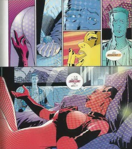
The lettering is over-designed and etiolated, breaking up on the printed page into faint lines and misleading the eye into thinking, at first, that the book is not actually written in English. It’s tiring and irritating to follow

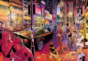
The acidic harsh colouring is, I believe, a deliberate tone-setting decision - but understanding the reason doesn't make it any easier, or more enjoyable, to read...
The colouring is harshly misfiring throughout. I infer that this is a deliberate decision, some sort of statement about the artificiality of the story’s environment, but it manages, without actually being off-register, to give the impression that the colouring plates are slightly maladjusted and off-centre.
The combination of the inadequate lettering and the strange colouring reminds me forcefully of the cheap shitty translated European albums which flooded the UK after the 1980s “legitimised” comics. Bodged out and badly-packaged to turn a quick profit while the bandwagon coasted, for the benefit of pretentious twats who’d read in the Guardian that “Graphic Novels” were in.
Presumably Image had a higher budget than the opportunistic translator/packagers of the 1980s, but regardless, the deterrent effect is remarkably similar.
Still and all, when you scrape off the cheap shitty veneer, what do you find?
The genuine cheap shittiness beneath.
Our hero, Simon Cooke, returns to his home of Saturn City after an hiatus of seven months to take back the reins of his business – with some implication that he was once some sort of vigilante into the bargain – fiddles about renewing old acquaintances, has drinks with his lawyer, attends a sex show, and… nope, that’s about it. It’s trying to be Blade Runner, it’s trying to be Casablanca, it’s trying to be Moebius, it’s… trying my patience.
Casey has done much better in the past – not least, by giving us protagonists we have reasons to give a damn about, a task at which he spectacularly fails here. He’s not so much phoning it in, as mailing it in. And the titillation factor is perfunctory. (Admittedly, I’m not the target audience, but I suspect it falls short even for my straight brethren.) Five pages of badly-choreographed faux lipstick lesbianism, and Fanny’s-Your-Auntie, show over.
People looking for eroticism in Sex will be sadly disappointed; which would be perfectly acceptable, if only the series appeared, on this initial showing, to have anything else to offer instead.
Tags: Image Comics, Joe Casey, Piotr Kowalski