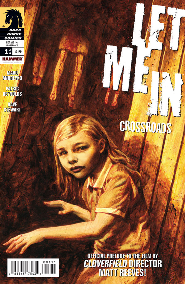
Let Me In: Crossroads 1
Reviewed by Peter Campbell 17-Dec-10
Dark Horse have long specialised in film and TV adaptations, with the results normally being of distinctly mediocre quality. Now here comes Let Me In: Crossroads, a comic book prequel to a film that’s a remake of the Swedish film Let The Right One In, which in turn was adapted from the novel of the same name. It’s a metatextual world we live in.
Dark Horse have long specialised in film and TV adaptations, with the results normally being of distinctly mediocre quality. Now here comes Let Me In: Crossroads, a comic book prequel to a film that’s a remake of the Swedish film Let The Right One In, which in turn was adapted from the novel of the same name. It’s a metatextual world we live in.
The cover, with its echoes of the film’s poster, is deliberately unflashy, and sets the tone for the contents. The cover also declares it the “Official prelude to the film by Cloverfield director Matt Reeves”, a statement that’s true but, when examined, has as much artistic validity as a declaration that it’s the official licensed toy. You suspect it’s there to give the misleading impression that Reeves actually wrote the comic or at least gave his blessing to it. The mechanics are probably much more crude than that.
As to the comic itself: I haven’t seen the film, but I’ve read the reviews (favourable) and seen the original, so have a good idea of what’s going on. And therein lies the problem. This prequel, so far at least, is a pretty straight rehash of the movie’s plotline, transposed to the US Midwest in the 1980s. Boy befriends vampire girl, who does thoroughly nasty things to the people delivered to her by her caretaker. In the middle of this is a plotline featuring a rather crude parallel between property developers and vampirism.
That’s its weakness, and it is a large weakness. Still, Marc Andreyko does a competent job of the dialogue and characterisation, which is rarely overstated, and it’s well-paced. Violence occurs off-panel, and the entire comic in fact has an unassuming feel. Patric Reynolds’ art leans towards the photoreal, with scratchy penlines and a heavy emphasis on blacks (always a good thing in my book). Looking through the pages, you could imagine them as storyboards for the director’s storyboards – they have something of that quality about them. The real star here though is the colouring job by Dave Stewart, with its beautifully muted colours in browns and greys and washed-out blues.
It’s not earth-shattering but, as movie adaptations go, it’s certainly one of the better attempts. If only the premise hadn’t so slavishly aped the original, then you’d have a pretty good comic book on your hands. As it is: B-. Could do better.
Tags: Dark Horse, Dave Stewart, Marc Andreyko, Patric Reynolds