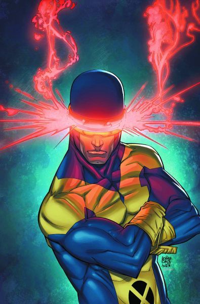
Cyclops 1
Reviewed by Martin Skidmore 04-Apr-11
This suffers the same fault as most other recent one-shots, in that it is utterly inessential, not being a notable or pivotal moment in Cyclops’ life, but what it achieves that the others don’t is being thoroughly entertaining, a virtue you don’t find in so many Marvel comics these days.
Regular readers may be surprised I bought this, given reviews of other Marvel and indeed X-Men one-shots of late. Than again, I couldn’t see much else on the racks this week that looked easily reviewable, and the art looked nice, despite a drearily generic cover, so I thought I’d give it a go.
It suffers the same fault as most of those other one-shots, in that it is utterly inessential, not being a notable or pivotal moment in Cyclops’ life, but what it achieves that the others don’t is being thoroughly entertaining, a virtue you don’t find in so many Marvel comics these days.
The story has Cyclops coming across some crime by Batroc and the Circus of Crime (is that an old association I missed or have forgotten?), working for someone else. Scott follows them, crossing paths with SHIELD and Hydra along the way, eventually confronting the villains and their boss (who is unfortunately rather overexposed of late, though depicted very well here). It’s handled with plenty of respect for Cyclops’s seriousness and leadership qualities and tactical acumen, somehow managing to do that and still offer a lightness of touch and gentle humour alongside it, a tricky combination to pull off, never sacrificing the character for the sake of comedy. A real pleasure to read.
But it was the art that made me buy it, and that is an even greater pleasure. Haspiel has one of those styles that we see now and again these days that looks retro, kind of like comics arguably ought to have looked in the ’50s or ’60s but never did, almost like an idealised Dick Sprang via Darwyn Cooke. He’s clearly looked at recent DC animation styles and Jaime Hernandez and others, and he has really learnt to draw, then to abstract some of that from genuine knowledge into something immensely bright and breezy, with plenty of energy in the action and what looks an easy precision in faces and expressions. There are all sorts of absolutely delightful panels here, and some lovely grace notes in the design too, never sacrificing narrative for them, but still using for instance the python in inventive compositional ways – I particularly like the scene in the restaurant for this.
It’s the first I’ve seen by Haspiel, and I will now basically buy anything else I see by him – this is beautiful, joyful art with imagination and huge craft, the kind of art that can make you happy whatever the story; as it happens, it’s a perfect fit for the story too, which more or less lives up to the superlative artwork, or at least doesn’t let it down. This may be an unnecessary story, another one-shot that has no good reason to exist, but it’s superbly done and a real delight, and I can recommend it to anyone who fancies a fun superhero story of the highest quality. I’m glad I have found good things to say about a comic like this, after so many rotten ones.
Tags: Cyclops, Dean Haspiel, Lee Black, Marvel, X-Men
I have to agree; this is a retro-delight, with a bubbly art style that should have been shown in the review, rather than the ‘blah’ stock-pose cover by a different artist. It actually takes one of Cyclops’ key handicaps – his stodgy dullness – and plays with it to delicious effect. Well worth a look.
I did try to find some interior art online, but failed.