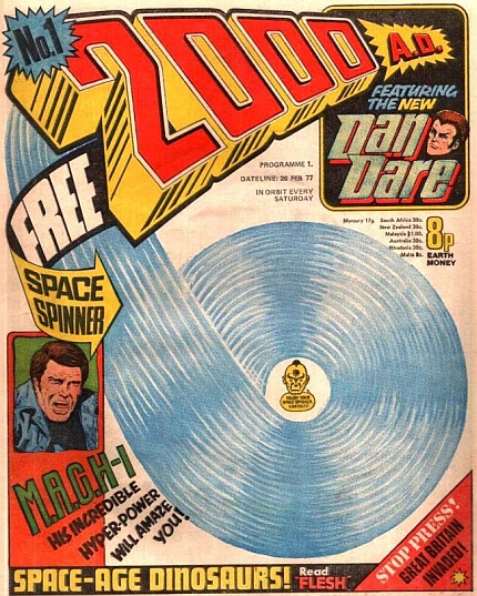
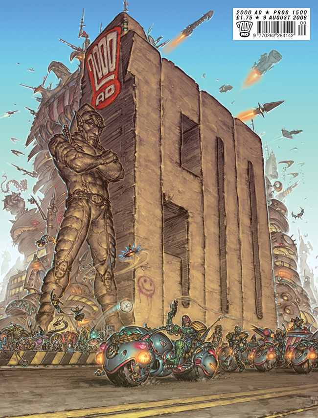
1500 2000AD covers
Reviewed by Tom Ewing 14-Dec-10
This video – the first 1500 covers of 2000AD, spooling past your thrill-addled eyes in 3 and a half minutes – surfaced on YouTube this week. Here are fifteen things I noticed about it.
 1500 COVERS, 15 THINGS TO WATCH
This video – the first 1500 covers of 2000AD, spooling past your thrill-addled eyes in 3 and a half minutes – surfaced on YouTube this week. Here are fifteen things I noticed about it.
1. THE MASTHEAD: The most obvious thing about the vid is how important the masthead has been – from the early-80s bubble writing (still my 2000AD) to the compressed logo we have now. You’ll see it shrink as the art gets more important – a couple of sudden jumps in size are especially noticeable.
2. DREDD: From about 30 seconds in, the continued presence of the flagship character is unmistakable: at times he’s almost omnipresent. Particularly so when there’s a film to promote of course, but also the prevalence of Dredd on the cover is a rough inverse guide to how potent the rest of the characters are.
3. ICONS: You also notice on this rapid-fire viewing how many of 2000AD’s key characters are defined by an easy visual ident – as a massive ax, or a goatee, or a weird shovel-like Warlock beak, or a sensually rounded bounty-hunters’ helmet flashes briefly out of the general mire of…
 4. VIOLENCE: This is a boy’s comic, though often one which treats its action with tongue very much in cheek. But that sophistication doesn’t come through on a fast-forward: 2000AD on this viewing crackles with violence. Even before it can be shown the covers are still full of explosions and particularly characters squaring off – time and again you see a cover split between two antagonistic figures, a composition that almost always seems to stand out.
5. FOUR-COLOURS: But at first most of the video’s nostalgia rush comes not from specific images but the palette of faded newsprint reds and washed-out yellows which defined the early covers.
6. SPEECH BUBBLES: And speech bubbles! So many speech bubbles! More than any of the pictures it’s these words which flash up and catch in the brain while you watch. When people think of classic newsprint-era 2000AD covers they don’t think in terms of images, after all, but in terms of text. THIS CURSED EARTH CANNOT BREAK ME! PLEASE – LET ME DROWN!! After about 90 seconds of the video they vanish, and text takes its place at the discreet bottom of the cover.
7. PROMOS: Fleetway rode out the recession of the early 80s by pimping any product it could get a tie-in with, so the most jagged stretch of the video is from this period, when films, bubblegum, BMX bikes, etc would suddenly take over the cover. Combined with shouts of FREE GIFT!! and you feel for the poor artists having to struggle to get a look-in for Return To Armageddon or whatever.
8. GUNS: My impression is that REALLY HUGE GUNS really become part of the standard cover vocabulary in the late 80s and 90s, doubtless following the American lead. Once in place, they never really leave.
9. COMPUTER GRAPHICS: As speech bubbles start to fade, you notice a lot of garish computer colourisation and background effects, tracking the arrival of 8-bit and then 16-bit software packaging into art studios. Mostly these have not aged well, and you’d be forgiven for experiencing this stretch of the vid as, essentially, Zenith vomiting onto your face.
10. PAINT: And then darkness falls, and the painted cover era arrives, where often the brightest thing on the cover was the red-on-white masthead. It all seemed like an excellent idea at the time.
11. FONTS: A particular pleasure, though, comes as Rian Hughes’ gorgeous pop art fonts briefly take over the comic and then linger enough to give the lettering some much-needed élan. Noticeable even on fast-forward, these anticipate the comic’s current look and have aged better than anything else 2000 did in the 90s.
12. TITS: Apologies for the crudity of the language, but there’s no other way to describe the arrival of the third pillar of the adolescent boy’s mind onto 2000AD’s cover. Roughly coinciding with the shift to Revolution as publishers, 2000AD discovered sex, and the guns and violence are now leavened by the occasional flash of alien cleavage. Actually, GAMS might have worked as well, since there’s plenty of thigh on display too – often sporting the “metal garter” look that is Rob Liefeld’s great gift to the world.
13. COLLAGE: And around this point designers trade up paintbox for Photoshop and we get an awful lot of mixed-media covers – like the promo mania of the early 80s, this makes for distracting viewing on the video as the eye has just enough time to notice the change in media even if it doesn’t take in the subject. Photos, defocused backgrounds, layers – dynamic and up to date but not always successful.
14. ILLUSTRATION: The last thirty seconds or so, though, suggest the comic’s found a better approach to covers – more stylised, striking, clear-lined illustrations making good use of both the colour palette and the space afforded to the artist. It even looks like the guns’n’boobs have been dialled back a bit too.
15. THE MEN IN BLACK: The final cover might be a reassuring image of The Mighty One celebrating the 1500-prog milestone, but it would be remiss not to mention his sometime replacements, who show up beside the masthead for a misguided 30 progs or so at the height of mid-90s conspiracy theory mania. The video inadvertently gives the longest look at the Men In Black fans have had for some time.
Tags: 2000AD
What I noticed viewing this yesterday (as I would) is the price bubble top right which goes from 8p til it gets to 80p and then is absorbed into the strip masthead (and Dredd moviemania). There are a few jumps in what appears to be cover quality which come with pricehikes, and the stripmasthead also brings in 8 EXTRA PAGES (with a jump to one assumes a £1 price point).
Hi Tom,
interesting observations. The finished up to date video is now on my youtube.
A lin on my website will let down download the stats I collected while making the video so you can see just how many time and where characters appear. Dredd himself has been on about one third of all covers. One thing you didn’t mention was the was newsagents’ price stickers or handwriting go skitting about the logo now and again. I guess this relates to which particular fan scanned in that chunck of Progs and gives me a kind of nostalgia of my pre-subscription days, collecting my reserved Prog from the shop. 🙂
I may be drunk, but (the first half of that) was FANTASTIC
The bloom goes off once everything become post-Bisley airbrushed, but I suddenly want to become rich and by everything up to immedately before Skizz II (or maybe the Summer Offensive, which I did buy at the time) and read it cover-to-cover, at a beach house