3 zombie comics
by Peter Campbell 13-Jan-11
Raise the Dead v2 2, I, Zombie 9, The Walking Dead 80.
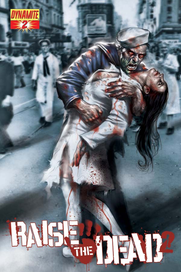
 Raise the Dead V2 2. Writers: Leah Moore, John Reppion and Mike Raicht, Art: Guiu Vilanova – Dynamite
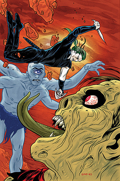
I, Zombie 9. Writer: Chris Roberson, Art: Michael Allred; Vertigo.
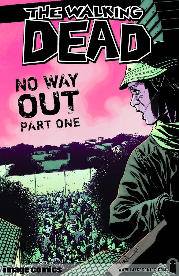
The Walking Dead 80. Writer: Robert Kirkman Art: Charlie Adlard; Image.
Zombies. What is it with zombies at the moment? Zombie films. Zombie TV shows. Zombie games. Zombie walks. And zombie comics.
Well, we know the reason for the zombie comics. The Walking Dead is one of the few breakout successes in the comics world over the last few years, and that accounts for the innumerable clones emerging recently.
Raise the Dead is one of the latest imitators, and it covers familiar territory. There’s been some sort of outbreak that is gradually turning everyone into a zombie including – and here’s the twist – all the animals . Whether this extends to insect life isn’t explained. In any case, it’s difficult to imagine how you could defend yourself from a cloud of zombie midges (“Quick! Out with the DEET!! Oh too late. I’ve been bitte- Mmmmm…brains!”). This aside, it’s fairly standard stuff. Lone survivors banding together against the oncoming plague, and the emotional and physical cost. Mysterious white-coated figures in underground bunkers. Rotting corpses.
 One of the surprising things about the new breed of zombie comics is the way they concentrate on the human characters, perhaps realising that 20 pages of unlimited gore would sate even the most bloodthirsty of readers. And so it is here – you have characters trying to adjust and survive in this new world, but at the same time they’re haunted by the events they’ve gone through. Structurally, much of the issue is told in flashback, and it seems unwieldy in that respect – too much looking back, and not enough looking forward. Overall, it’s fairly well handled, with some underplayed, believable touches to the characterisation. Guiu Vilanova’s art can convey emotion and (when necessary) gore successfully, though his actual drawing technique can seem quite crude at times. He especially seems to have a problem with drawing arms and with foreshortening. On a level of competence, if you think of the average artist in the Vertigo line, you’ll have a fair idea of the skill level involved.
What this amounts to is a comic that’s not astounding, but not dreadful either. It’s a shame that it’s a limited series, because there’s the possibility this could develop into a pretty decent comic. Two issues in out of four, though, it’s just a somewhat average one.
Speaking of Vertigo, I, Zombie is their own pitch at the genre. It aims itself squarely at the alternative market, focussing on a young and sweet and somewhat goth teenager who lives in a town seemingly populated by bit characters that resemble, or are, monsters. Oh, and yes, she’s a zombie who keeps herself alive by eating brains.
 In this issue she goes on a date to a miniature golf tournament, while in the background a number of supernatural characters go about setting up what you presume are elements of the larger plot forming the arc of the storyline. It’s slight, inoffensive and aims to be wittily zany and charming. Unfortunately it’s all a little bland and is certainly badly structured with an overabundance of plot elements that intrude on, rather than complement, the main thrust of the narrative. Michael Allred’s art is as distinctive as ever but seems rushed – in several panels the characters faces don’t change expression from scene to scene, and there’s an overall lack of detail that seems unlike him.
Some of these problems – the fragmented quality, the overall niceness of the characters – may be resolved when read as a larger story arc. As it is, this was a little too insipid for my tastes.
That just leaves the big one, the granddaddy of them all. The Walking Dead was the comic that initiated this onslaught of titles, or at least was perfectly poised to take advantage of the public’s burgeoning zombie fascination. Now in its 80th issue it remains much as it began – a solid, dependable comic. Look at the early issues and look at the latest, and there hasn’t been a great deal of development. Robert Kirkman still likes an ensemble cast, a slow-moving storyline, and copious quantities of dialogue. Charlie Adelard’s art remains rough-hewn, with a pleasingly British quality – it always reminds me of Pete Sutherland, who drew Tupper, Tough of the Track, for some reason. With such a dialogue-heavy script, his ability to avoid turning each issue into frieze of talking heads is especially impressive.
This issue moves the storyline that little bit further forward. There’s another zombie attack, a community under threat, and new relationships formed. It’s an enjoyable enough sliver of a larger whole, but if you’re going to read it, the collected volumes are the way to go.
And, of the three titles reviewed here, it remains the only one I’d read again in the future.
Tags: Charlie Adlard, Chris Roberson, Dynamite, Guiu Vilanova, I Zombie, Image, Michael Allred, Raise the Dead, Robert Kirkman, Vertigo, Walking Dead, zombies