Shazam! 1
Reviewed by Martin Skidmore 27-Jan-11
The first impression inside is that either some weird meta move is being pulled, or someone fucked up the colour registration, as much of it is out of focus. I am pretty sure it’s the latter. If that was the worst I could say about this dreary, vacuous comic, maybe that wouldn’t be so bad, but it’s terrible throughout.
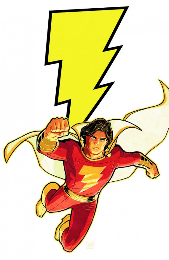
The Cliff Chiang cover is very poor here: a standard flying pose, the modelling handled rather crudely by the colouring, a blank expression. I don’t mind DC’s new move of shoving the title into tiny letters in the corner, and I don’t mind generic covers not suggesting a story – but you do need something to grab your interest. Other than this guy not looking at all like Captain Marvel (is this Junior, perhaps?), there is nothing interesting here at all.
The first impression inside is that either some weird meta move is being pulled, or someone fucked up the colour registration, as much of it is out of focus. I am pretty sure it’s the latter.
If that was the worst I could say about this dreary, vacuous comic, maybe that wouldn’t be so bad, but it’s terrible throughout. Billy and Mary have had their powers taken away, for reasons not mentioned here, and Freddy has been away because of, um, something that happened, but now he’s back, for some reason. And so is Blaze, a demonic villain, who they trick in a completely pointless way for no detectable reason, then Freddy defeats her, thanks to her apparently stopping fighting and letting them win, though that’s not what the writing thinks has happened.
So yes, that was Captain Marvel Jr on the cover, albeit with a slightly different costume than in the comic. In fact he never looks like that cover depiction inside, what with the artist not knowing what his hair or costume or face or body are like, so he looks different from one panel to the next. Cliff Richards also can’t do expression at all – he can manage wide-eyed and open-mouthed, so you have some vague idea what the face is supposed to be doing, but there are a whole range of expressions that include that, and I had no idea which he intended. On the less exaggerated faces, there’s simply nothing. His layouts are poor too – a couple of times I had to pause and guess what to read in what order, and check back that it made sense. There’s no sense of grandeur in the scale of the fight – afterwards, Billy says the fight destroyed half of downtown (miraculously no one was killed, they tell us, harking back to decades ago), but you would never believe that from the artwork. There are some panels where I can’t work out what is happening.
The writing is no better. Besides the fatuity of the plot, a pointless story that can barely even evoke a ‘so what?’ shrug, the dialogue is painfully bad, especially when he tries to write banter. The quiet dialogue falls flat too, but I guess almost anything would with such blank faces. It’s also far too much like every other superhero around. I’ve always believed that if you get an existing superhero to write, your first thoughts should be about what distinguishes this character from the millions of other superheroes. There are a bunch of answers with this cast, and Eric Wallace seems to have chosen to ignore most of them. In particular, Captain Marvel comics have traditionally had charm, fun, likeability and a sense of humour, and this has no hint of any of that – gritted teeth, impaling the villain, dark tensions between the Marvel family and all the other stuff you find everywhere else.
Another comic where I can see no reason for its existence at all – and every reason why editors should have stomped on it long before the printers managed to make it even worse.
Tags: Captain Marvel, Cliff Richards, DC, Eric Wallace, Shazam