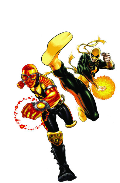
Power Man and Iron Fist 1
Reviewed by Martin Skidmore 10-Feb-11
I’m trying lots of new titles these days. Despite liking the old title, many, many years ago (an oddly charming run, I thought), the crappy cover here nearly put me off.
I’m trying lots of new titles these days. Despite liking the old title, many, many years ago (an oddly charming run, I thought), the crappy cover here nearly put me off. I can’t make sense of the positions, perspective or colouring – it’s as if two separate illustrations had been cut-and-pasted into one. There’s no signature or internal credit, so maybe it is two different artists. I have just realised that all of the images of this online have Iron Fist in the old colours, which he has changed to a kind of purplish grey recently, so maybe that recolouring is part of the why it looks so off.
Sadly the interior is as poor as the cover. The Power Man here is some new kid with immense power, taken on as an apprentice by Iron Fist. He apparently absorbs chi from the environment – I thought chi was some sort of inner life energy, so does that make him some sort of spiritual vampire? There is no hint of that, if so. Anyway, the two argue in dumb ways in stiffly scripted tones, and we aren’t told how they got together or why this new Power Man wants to work under someone else, since he keeps objecting to it. I’m also a bit unclear as to who Danny Rand is now – last I knew (in recent New Avengers comics), and according to the text intro bit here, he is a billionaire, but here he moans about a neighbourhood association being slow in paying him a fee.
The story itself is worse, indeed idiotic: the old team’s office manager has been convicted of murder. She tried to contact Danny or Luke, but they were always off planet (she couldn’t have left a message?). Yes, that’s Iron Fist and Luke Cage, constantly in another dimension or on an alien world or whatever. Unless they both acquired some 1950s Batman writers when I wasn’t looking, this makes no sense. Nor does her story: “Of course my fingerprints were on Gene’s guns – I was his executive assistant!” Right, superheroes have their office managers handle their guns, and the villains knew this, and used it to set her up. There are also some dreary villains, who may or may not have been the actual killers – which brings me to the art.
If you can’t make a splash page of a homicidal clown with a meat cleaver look dramatic or scary, it is time to quit this career. No ifs or buts about that, you are simply no good at it. Alves also fucks up the action – in the heroes’ fight scene (which is apparently 100% irrelevant to the rest of the story), I was convinced the bad guy had just two goons with him, possibly three, but then when the fight starts there are clearly several more, like a dozen in total. But he is worse still on faces – lifeless, awkward, with eyes angled wrongly, hardly any detectable expression. Well, to be fair, there is one where a woman is plainly very cheerful, but since the word balloon could hardly contradict that more, I’m not counting that to his credit. This is probably not helped by having three inkers and as dreary a colourist (Bruno Hang) as I can remember seeing – anyone who decided that the crazed killer clown with, I think, blood on his cleaver should all be in shades of grey also needs to seek a new career.
I’m starting to grasp that this inept stupidity actually is the general standard of Marvel & DC these days. Can’t they just cut their lines by half, say, and get rid of all the blatantly substandard, lifeless crap? It’s not as if it sells a lot or will make them money. Or maybe get some editors who can help the creators a bit? (It’s far too depressing to imagine that these are the results with significant editorial help.)
Tags: Fred Van Lente, Iron Fist, Marvel, Power Man, Wellington Alves