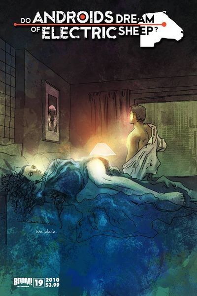
Do Androids Dream of Electric Sheep 19
Reviewed by Peter Campbell 04-Jul-11
Do Androids Dream of Electric Sheep isn’t Philip K Dick’s best novel, but, thanks to Blade Runner, it’s by far his most famous. This adaption retains all the novel’s text, and is clearly a labour of love. Sadly, it’s also not very good for precisely those reasons.
Do Androids Dream of Electric Sheep isn’t Philip K Dick’s best novel, but, thanks to Blade Runner, it’s by far his most famous. This adaption retains all the novel’s text, and is clearly a labour of love. Sadly, it’s also not very good for precisely those reasons.
If you’re unfamiliar with the novel, it’s follows the exploits of a bounty hunter, Rick Deckard, who is hunting down renegade androids who have escaped to earth from a life of slavery on Mars. Decker becomes involved with Rachel, an android who believes she is human, and this raises ethical and philosophical quandaries in Deckard’s mind about the work he is doing, and what precisely it means to be human.
This isn’t quite the latest issue of the comic, but is worth focussing on because it centres on a pivotal scene in the novel: Rachel’s seduction of Deckard. It’s pivotal both to the plot line, and to the book’s central themes. It’s set in a single room, and consists mainly of conversation. This presents a singular problem: how do you make it visually interesting to the reader without reducing the page to a succession of talking heads?
Robert Parker doesn’t entirely surmount this difficulty. The pages are composed almost entirely as a series of rectangular panels. Events are viewed from a distance, in close up, from above, are seen through the hotel room window. There are flashbacks to earlier episodes. It seems restless at times, rather than inventive. In the scene where Rachel refills her drink, why is the perspective almost godlike, viewed from far above (higher surely that the hotel room ceiling)? Why, when she speaks, does the panel focus so frequently on her lips, rather than showing the impact of what she’s saying? There’s the sense that Parker’s so concerned about overcoming the episode’s static nature that he’s forgotten to consider whether the viewpoint is appropriate or not.
Matters aren’t helped by his artistic style. There’s a slick, airbrushed quality to the finished art that evokes the sterile future, but paradoxically looks somewhat dated, as though it’s been dredged from a 1980s issue of Heavy Metal. The page design is strong, but somewhat unimaginative: each page makes the reader’s eyes follow a zigzag pattern from top to bottom. Facial expressions are limited, in Deckard’s case to either fury or a harrowed grimace (Rachel’s seems equally restricted though you could argue that this is a deliberate artistic decision).
Still, the real problem here isn’t the art: it’s the text. By including all of Dick’s text from the novel, it makes for an unnecessarily cluttered reading experience, and although the length of the adaption makes it less cumbersome than reading an issue of Classics Illustrated, it still encounters many of the same difficulties. If the caption reads: “She then dropped onto the bed, rolled over to fumble for her glass, accidentally pushed the glass to the carpeted floor,” then is there any reason for the panel to show her dropping the glass? It’s the comics equivalent of a split-infinitive. There are numerous examples like this throughout.
Dick’s writing also comes off poorly. As a writer, he’s not a great stylist. His brilliance shows in many ways: his psychological insight, the obsessiveness of his themes, the unexpected moments of humour, and the trap-like constructions of the novels with their many layers of reality. By stripping the words apart though, by emphasising phrases, you can see how trite much of the actual language used is: “she laughed sardonically”; “she shuddered”; “for a time she slouched around the room, brows knitted darkly”. The problem here is of over-reverence, of not jettisoning the unnecessary, of not, ultimately, making this work suitable for the medium it’s being adapted for.
What this reminded me of ultimately, was the pioneering “illustrated novels” series Byron Preiss released back in the late 70s. They were innovative, the people involved were talented, and you could view them as a precursor to the graphic novel boom. As works though, they were flawed, and they’ve now been virtually forgotten. Why? For the same reasons displayed here – they were neither novel nor comic, and the two mediums clashed rather than complemented. Full marks for trying, and I’m happy to see Dick’s work exposed in any medium, but on the evidence here, I’d have to write this off as a loving but ultimately unsuccessful experiment.
Tags: Boom!, Philip K. Dick, Robert Parker