Ten Good Reasons to Read Yourself Raw (and one reason why you shouldn’t)
by Peter Campbell 18-Oct-10
A comprehensive overview of all the contributions to RAW would seem endless, and would probably make your brain melt, so instead Peter Campbell offers, in no particular order, the ten things that made RAW so groundbreaking and essential.
So how did we get here?
By here, I mean the journey over the last twenty years where the perception of comics has changed from the point where they were routinely made the objects of denigration (“comic-book characterisation” being a common criticism) to their current status where they have infiltrated the mainstream, are regularly reviewed in the broadsheets, and no book shop can be without its graphic novel section.
You may point the finger here at Watchmen, or The Dark Knight, or Ghost World, or Palestine, or Jimmy Corrigan, and you’d be right to, because these were all major steps on the way to mainstream acceptance. Maus aside, RAW magazine gets less credit for the revolution that’s occurred, which is unfortunate because the influence of its ideas galvanised the comics arena in ways both large and small.
RAW began as the brainchild of Art Spiegelman and Francoise Mouly. The idea was to gather together like-minded comics artists, creating a high-end showcase for the very best comics art had to offer, while acknowledging its yellow pulp origins. It was comics with a sense of history.
That in itself was something fairly novel. Comic books have long had continuity, of course, but it’s tended to be continuity of character and location. Marvel built an entire empire from that concept, with its interlocking characters and crossovers and detailed reference to events gone before.
RAW’s approach was somewhat different. It demanded the reader had some recognition of the form and history of the comics medium. It’s impossible to fully appreciate many of the stories published without being aware that they carry echoes from other publications, other artists, other times. Yes, it’s possible to read and enjoy Jooste Swarte’s contributions without being familiar with the work of Herge or George McManus, but their subversive atmosphere is so much more enjoyable if you are.
That’s a very High Art concept. Mix that with comics’ wilfully Low Art origins, and you have something quite powerful and rebellious in your hands. The taglines on later editions would push forward this idea: high culture for lowbrows; required reading for the post literate; the graphix magazine that overestimates the taste of the American public.
Spiegelman had attempted something similar in the 1970s, with Arcade magazine. It appeared in the underground movement’s twilight years, assembling a cast of contributors few other comics could rival at the time: Robert Crumb, Justin Green, Spain, Kim Deitch, S. Clay Wilson. It wasn’t a financial success and went largely unnoticed. Many of the same artists would reappear in the pages of RAW, along with a younger but like-minded contingent of contributors.
When RAW first appeared it seemed like an enormous influx of talent had appeared out of nowhere. There were artists from the continent, their names sometimes familiar but their work previously unseen in the US. There were artists almost but not quite from the underground movement. There were artists wheeled in from the outsider art movement. There were artists that were, quite frankly, so far removed from anything seen before that their work was as much about the shock of the new as any inherent ability on display.
Looking back, from a perspective of nearly thirty years later, it’s surprising how few people were regularly involved in the magazine’s creation. In all, there were perhaps a dozen regular contributors, even though, at the time, every issue seemed into introduce a wealth of new and exciting talent. The style and subject matter of each artist was diverse, but possessed an underlying unity that lay in the perspective and awareness with which they produced their work.
A comprehensive overview of all the contributions to RAW would seem endless, and would probably make your brain melt (or it would make my brain melt anyway). Here, in no particular order, the ten things that made RAW so groundbreaking and essential, according to my particular prejudices at least:
One – It sought a new audience
RAW started off a low-circulation publication, with the early issues in particular having a very limited print run. It took a small-press sensibility (right down to the printing press, located in Spiegelman and Mouly’s apartment), but set ridiculously high standards for itself, and eventually penetrated the mainstream.
You can argue this was really a legacy of punk, and new wave, of all the bands and fans that started up doing their own little fanzines and making their own records, bypassing the mainstream companies altogether.
If it worked for music, why not for comics? There was certainly something of that sensibility around at that time. This was the era when self-publishing became a possibility because distribution channels that previously didn’t exist became available, and a core community of knowledgeable, literate fans existed in high enough numbers to support these publications.
RAW tapped into that particular era’s zeitgeist, but did so more publicly, and with more ambition than many of the others. In the process it became the masthead for every disaffected comic artist around the world. This was partially smart marketing, and partially dumb luck, as this was also the era when the first comics aren’t just for kids wave appeared.
Comics up to this point had relied on traditional newsstand distribution, but if you look at the rapidly dwindling circulation figures of the mainstream publications from the seventies through to the eighties, you can see this was no longer a terribly effective way of reaching an audience. There are two ways of reacting to this. One is to retreat, and to rely on a core following, and the other is to break out to a wholly new audience.
RAW did both. It sold to comics books shops (the core audience) but also to art stores. It aimed at the counterculture and the downtown art movement that was interested in something edgy and experimental. The Graphix Magazine for Damned Intellectuals, it called itself. No mention of comics, you’ll notice. The use of the word graphix, like the earlier use of comix, attempted to bypass those prejudices.
So you have an audience: but it’s a limited audience. The next step, the obvious step, is to break out into the mainstream. Which RAW proceeded to do, signing up a distribution deal with Penguin books. By this point, its circulation exceeded 40,000, which, for a literate, experimental publication, is pretty extraordinary. Remember that this was the 1980s, and graphic novels hadn’t infiltrated the mainstream in the way they have now.
So this is the first part of RAW’s legacy: a recognition that the comics landscape was changing and, with that recognition, helping to change it further. Further perhaps than Speigelman and Mouly could ever have imagined.
 Two – A cutting sense of design
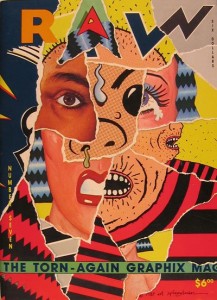
From the outset, RAW looked different. It was produced in oversize format, and was beautifully printed on high-quality paper. It wouldn’t fit in with the rest of the comics being released, on a physical level if nothing else. There was no way it would slide into the revolving display racks that traditionally held comic books.
The credit for this must fall to Francoise Mouly. In later years she would be the art editor for the New Yorker, but you can see the results of her skills here. RAW looked bold, slightly punkish, more than a little arty, and quite unlike the other comics available at the time.
This appealed to people’s elitist sensibilities. It made you feel you were part of this small, cult concern, even as the circulation grew and the comic started receiving coverage in hip, truly mass-market publications.
The impact was as much about the comic as artefact as the actual contents. It promoted the idea of the unique, the collectable, and it did so within the constraints of a mass-medium publication. Every fanboy (and girl) knows at least a little about the collecting compulsion, and RAW cleverly pandered to these impulses.
And in actuality it was a unique object. It had die-cut covers and inserts containing mini comics or trading cards or flexidisks. It printed different stories on different colours of paper, or different grades of paper. This reached some sort of apogee with the issue in which each cover was carefully hand-torn, with the torn corner neatly taped to the interior table of contents.
At the time, that sort of attention to detail was unique – certainly in the comics world – but now it’s become commonplace. The meticulous production values afforded to each issue of McSweeny’s magazine can be traced back to the ideas generated by RAW, and you can see the same process at work in Chris Ware’s work, and elsewhere.
A more unexpected development is the emergence of the small companies that have taken the do-it-yourself ethos, and the attitude to publishing unique objects, and have built small, thriving industries from them. There’s a huge array of publishers producing limited-edition silkscreen comics that capitalise on the fact that they’re uncommercial and unique. And, accordingly, they’re more expensive, just as RAW was, in its time, an expensive comic to buy.
You might argue this is a retrograde step for the comic industry’s mass-market ethos, but in actuality it’s a blurring of the worlds between fine and commercial art, which is one of the things RAW was all about.
Which leads us nicely onto…
 Three – Art Spiegelman
MAUS has been critiqued to death, and deservedly so. The odd thing is that in many ways it’s an atypical work. A large portion of Spiegelman’s comics are about experimenting with form as much as content.
You can see that particular ethos at work in the early issues of RAW in particular, not only in Spiegelman’s own contributions, but in the work he chose to publish. And the blurring of lines between High and Low art were very much on his mind.
It’s a mini-comic in the very first issue of RAW that best summarises this unspoken manifesto.
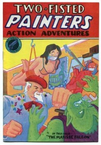
‘Two Fisted Painters Action Adventures’ is both hommage and parody, a tricky comic-within-a-comic that plays around with narrative and form. The title’s a steal from EC’s Two Fisted Tales, and it’s immediately followed by a quote from Robert Rauschenberg. Right from the outset it’s announcing its intentions.
The storyline’s a nonsensical satire of pulp imaginings: a hack, alcoholic, chain-smoking writer feverishly hammers away at a manual typewriter, seeking inspiration for the latest issue of Two Fisted Painters. After an initial failed attempt at a storyline, he hits on the idea of a alien who is stealing colour so that he can become a famous artist on his own planet (on which colour doesn’t exist). The alien is defeated when it’s stabbed in the back with a pen branded by a conceptual artist who specialises in murdering painters. The writer abandons his story in disgust but the alien returns to ghost-write the final, missing, section before absconding with the typewriter, which it has fallen in love with.
So far, so banal. And deliberately banal, at that. Looking at it in more detail though, you can find a whole host of references and steals from both high and low art.
Taking it from the top (or the front, if you prefer)
The cover’s a Jack Kirby pastiche with lurid colours. The artist punches an alien with trademark Jack Kirby fist. A bound and gagged woman hangs from a meat hook. She’s mirrored by another figure in red, similarly bound, painted on a canvas.
The story begins with a Robert Rauschenberg quote “When I have not zee red, I use zee blue.” Rauschenberg straddled the period between abstract expressionism and pop art, (the “action” of the title). His paintings were divided into different colour periods (black, white, red), much in the same way that you have Picasso’s blue and rose paintings.
Immediately below this, there are four symmetrical panels, beginning with a painter staring at his paintings. This section is in black and white and the line used recalls the heavy lines comics artists used to have to use back in the days of pulp paper and crude printing techniques.
Subsequent panels depict the artist’s paintings, but they’re in different washes of grey. To the left of each panel is a colour: black, blue, red, yellow. This recalls not only the four colours used as the constituent elements in printing comics (“four-colour comics”) but also the colour periods in Rauschenberg’s paintings.
Enter our hero, the hack writer. These panels are still all in grey. He’s battling for inspiration with the deadline for Two Fisted Painters. There’s a couple of reference points here: the writer used to work for Topps bubblegum (as Spiegelman did), but the chain-smoking, heavy drinking writer also recalls the hard boiled writers of the thirties and forties, which is also recalled in the narrative captions used.
The sound effects for the typewriter (and colour is the key for imagination in this story) are in red. They act as a transition to the scene in the bottom panel, showing a painter painting a still life, along with his model, who is holding a jar of wine, in Hellenistic pose. Strangely, he’s painting the still life, but not the woman posing. This scene’s in colour. It’s drawn with the same thick lines that depicted the artist’s first appearance, but the colours used to fill the lines recall both Matisse and the traditional block colouring in comic books.
Inspiration’s lacking. “Did you ever consider…macramé?” suggests his model, looking at the identikit still-lives. The suggestion’s that traditional painting’s a dead-end. Flip back to the hack writer who decides to have the artist commit suicide by swallowing a tube of paint, but then changes his mind (“good, but too short”)
Cue a change of direction. Enter a performance artist whose speciality is murdering artists. The panel in which he appears is a direct reference to Marshall Rogers’ sterling run in Detective Comics, the panel border folding inwards in the same shape as Batman’s cloak, while the idea of performance art killing off traditional painting has long been debated in art circles.
Flip back to the writer. “Yes more original!” he exclaims, typing feverishly. And it’s significant that original here = pulp. What’s long been considered trashy becomes a source of inspiration and energy.
“The colour drained from his face” reads the typed narrative.
This is followed by a series of identical panels down the left hand side of the page that recall the silkscreens of Andy Warhol, each identical, but with different colour variations. This also signals the entrance of an alien who proceeds to drain colour from all of the characters. The alien’s head is the same shape as the writer’s typewriter.
Colour leeches from the characters. Suzette, the nude model, runs down a staircase (referencing Duchamp), the colour slipping from her as she does so.
As the colour is stolen from the characters, so similarly inspiration starts leaving the writer. The alien departs, and they chase after it, following the bleached trail it leaves through the streets.
It’s revealed that the alien is from a planet with no colour. The alien’s depicted standing in front of a colour chart, and is drawn with dots and lines – bringing attention both to form, and again recalling the stippled dots in comics, and in Lichtenstein’s pop art. The alien’s also an artist.
On learning this, the performance artist leaps over and stabs him in the back with an oversized pen. “Killing a painter from outer space – that ought to get me a Guggenheim.”
Here comes the conclusion. The characters smash the jars of colour the alien has siphoned, while their actions are mirrored by the writer, who throws away his typewriter, before falling into a drunken sleep. Significantly, the colour splashes out into the imaginary narrative into the writer’s world
As he sleeps, the typewriter starts typing by itself, bringing about the ending of the storyline, in typically cynical fashion. The alien fades in, revealing that it’s doing the typing. An artistic creation has taken on independent form.
Finally, the alien absconds with the typewriter which he has fallen in love with, and taking it away to his planet with them. This section’s accompanied by a series of captions that recall the purple clichés of romance comics.
On one level, this is all pretty silly. It’s jokey, and self-referential. At the same time it can be read both as a critique and homage of pulp, and comics, and painting and conceptual art. The story, entertaining though it is, isn’t really the point. It’s about the different directions comics can move in, and about playing around with narrative structures.
It’s pretty astonishing, really.
Four – There’s life outside of the USA
Comics aren’t only a U.S. concern.
It’s obvious now, but the wealth and diversity of comics that existed outside of the U.S wasn’t nearly so evident at the time. Tintin and Asterix were a staple of any bookshop, but to find any work beyond that you had to rely on Heavy Metal magazine, and that tended to feature not-terribly-well-translated science fiction and fantasy stories.
RAW introduced work from like-minded artists in Europe and further afield, and although they shared a common sensibility, they differed widely in their styles and themes. This was where you could find Joost Swarte and Lorenzo Mattotti and Loustal and Marti and Mariscal and an entire range of artists whose comics had seldom if ever been seen in English translation before.
Picking through this wealth of material is difficult, but here are two personal favourites.
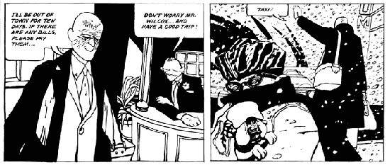
‘Mister Wilcox, Mister Conrad’ introduced the work of Jose Munoz and Carlos Sampayo to the English speaking world. It’s hard now to overestimate the impact this strip had at the time, and how different it seemed to the work we were used to seeing. The storyline is simple, and even a little worn: a professional assassin meets and befriends his intended victim. They’re both lonely, isolated men, and the friendship is genuine. They exchange gifts, and spend a great deal of time in each other’s company. At the end the assassin ends up killing his friend anyway, because that’s his job.
What’s different is the atmosphere generated by the art and script. This is a sleazy, decadent world that’s hewn out of black, with figures that seem to melt under the weight of their despair. You can see some precedents, primarily in the work of Alberto Breccia, but after that you need to look out of the comics sphere, at the likes of the work of George Grosz, and the German expressionists.
There isn’t much love in Munoz and Sampayo’s world. Everything’s slurred and brutal, from the inhabitants of the bar in which they meet, to the two central characters who – despite the friendship they form – are rich and powerful, and entirely ruthless. They buy expensive fripperies – rare stamps, luxury cars. They beat up a drunk, they hire prostitutes. The only morality on display is the morality of the assassin, who feels obliged to carry out his work, despite the bond that he and his intended victim have formed.
It’s not, admittedly, a barrel of laughs. There’s a dank and unremitting sense of disgust and despair throughout, captured perfectly by the art that features bit characters whose features slur like candle wax. You wouldn’t want to live in that world, but it’s a fascinating place to visit.
From the moment of this story’s appearance, copyists began to emerge – notoriously, Keith Giffen, but it’s also impossible to imagine Frank Miller’s Sin City existing in its current form without the precedent set by Munoz and Sampayo. The irony being that relatively little of their work has appeared in translation since then.
Francis Masse is another artist whose work has been translated too seldom. His immensely detailed artwork often appears to have been created by etching, through that may just be a clever illusion. It’s also very verbose, surreal and blackly funny.
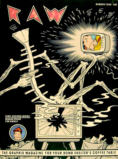
‘A Race of Racers’, which appeared in RAW 4, describes a world in which its narrator (large-nosed, wearing a bowler hat, suit and trenchcoat, like most of the world’s inhabitants) races around and around the planet ceaselessly. When, one day he’s forced to stop, he discovers the ground has disappeared, and another world is mirrored beneath his feet. Buildings are reflected by other buildings, people by other people, but the mirror images are not identical. In fact, the people underfoot imagine they are being supported by those above, just as those above imagine they are being supported by the people underfoot. Avarice abounds, and arguments ensue. A war breaks out between those above and those below, and the whole mirrored world turns against itself, leaving a solitary newspaper boy to wander alone, with only a crudely drawn hand-puppet to speak to.
Like all of Masse’s work, it’s thought-provoking and quirky. Although the storyline’s slight, it throws up all sort of interesting philosophical questions, but does so in a blackly amusing fashion. It reminds me of the cruel, playful qualities you’d find in Alice in Wonderland or, more pertinently perhaps, Alfred Jarry. And the artwork that accompanies these absurdities is magnificent: detailed cross-hatching, precisely-drawn architecture, grotesque figures that bring to mind Magritte and the Yellow Kid yet remain unmistakably Masse’s own.
Of all of RAW’s legacies, the introduction of non-US artists is the one that has taken longest to reach fruition. It’s difficult to understand why. Perhaps the artists themselves, superstars in their own countries, didn’t feel any need to crack the US market. Maybe the work itself was too far removed from American tastes. Maybe it was because the US publishing industry formed its own little act of colonialism, appropriating the most talented and commercial of artists and writers for their own publications.
Things are gradually changing though, and you can see an increasing number of European creators in translation, albeit primarily via the smaller, more adventurous publishers. There have been a few genuine breakout successes but you suspect there’s much more similar work to be discovered, as with Yoshiharu Tsuge, whose delicate, subtle work appeared in RAW’s pages towards the end its run, but which has yet to be translated in any sizeable quantity.
Five – the resurrection of the underground spirit
RAW grew out of Arcade, which in turn grew out of the underground movement. At this point most underground comics were going through their death-throes, the energy and vitality that first provided inspiration having lost its momentum, which left a selection of uninspired, rather puerile publications. The shock factors of sex, death and drugs can only go so far.
Although the comics themselves were dying, the artists who had populated their pages were still produced work, though it was often a faint echo of the anarchic spirit that had launched their careers.
Arcade relied heavily on underground artists, but they were used more sparingly in RAW. This may have been a conscious decision, a device to draw a demarcation line between RAW and the underground movement, seen at that point as being a little passé, and certainly more than a little tired. Those that did appear were among the finest examples you’ll see from the underground movement’s main players. It was as though, in the pages of RAW, they found themselves reinvigorated.
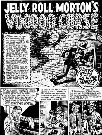
Take Robert Crumb’s ‘Jelly Roll Morton’s Voodoo Curse’, for example.
Crumb had been a staple of Arcade, but his own Weirdo magazine, begun around the same period as RAW, had taken up much of his time and energy. This may explain his comparative absence in RAW’s pages. This contribution’s a killer piece though, prime mid-period Crumb, with its storyline mixing jazz, voodoo, obsession, and wry deprecation.
Crumb always had artistic ability and vision, but the extent of his abilities was sometimes hidden behind the shock factor of his early comics. This story is very much of a piece with his eighties output. It’s perhaps more mainstream, more controlled, and certainly had none of the vapidity characterising his art during the low period of the 1970s. Or maybe it’s just that he reserved his more kitsch obsessions for the pages of Weirdo.
Whatever the reasons, you can see the fruits here. Crumb’s draughtsmanship has been praised, justly, with his ‘A Short History of America’ becoming an iconic description of the development of America’s landscape. But here you can see his real strength is in his depiction of characters. There is very little in this story that is long shot – virtually everything is in close up, or mid-frame, allowing us to concentrate on the character’s expressions, matched by the captions containing the narrator’s voiceover.
These people are a long way from the deliberately offensive caricatures of his early work – you look at them and there is real depth of expression and ambiguity of emotion in their features. And the storyline is classic Crumb too, the biographical tale of Jelly Roll Morton, a record producer and musician, grappling with the attempt to free himself from the possible curse cast upon him.
It’s perhaps unfair to single out Crumb for attention. You could equally make a case for Kim Deitch’s nostalgic, subversive tales, or Justin Green’s autobiographical works. As a whole the underground artists appeared reinvigorated by the company they kept in RAW’s pages, spurred on perhaps by competitive impulses. They also provided a pointer as to where many of the newer artists represented had originally found their inspiration.
It may be overstating the case to say RAW saved the underground movement, but it certainly gave it impetus and a new sense of the sort of directions it could explore in the future.
Six – The dividing line between gallery art and comics is thinner than you might imagine
You can argue it began with Roy Lichtenstein’s paintings but it’s a two-way-process. You can take a panel from a comic and make it a painting, but you can also take the artists who traditionally found themselves on the walls in an art gallery and introduce them into the comics medium.
Around the time RAW appeared, this is what the Bazooka school of artists were in the process of doing. They combined post-punk cut up graphics, dadist theory and a love of popular culture, and the results – gaudy, a little flashy, a little disturbing – were popular in the hipper fashion/music magazines of the 1980s, and well as in deathly trendy art galleries. Their paintings and illustrations also appeared in RAW, one page contributions that weren’t comics, but which acknowledged the styles and techniques of the comics medium.
The artist who received the most exposure was Pascal Doury. Not coincidentally, he was also the artist whose work was displayed in a form most similar to traditional comics narrative.
Pascal Doury is the comic medium’s best-kept secret. This is for a number of reasons: his work appeared in very small circulation French publications. It’s often explicit. And he’s dead.
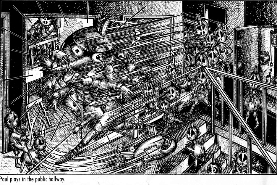
The most substantial exposure for his work was in pages of RAW. The first major piece printed, ‘Theodore Death’s Head’, was censored – carefully blanked out areas where all the genitalia should be. Readers could send off for a series of stickers to carefully paste into the censored areas. By the time ‘Paul’, the second Doury contribution, was published, Penguin had taken over the distribution, and this time the work was left uncut.
‘Paul’ tells the story of a young schoolboy, his experiences at school, and at home. It’s designed like a child’s picture book – one large picture, and then a caption beneath it.
It’s unclear whether Doury had produced a series of related drawings which the captions were then created to fit, or whether it was designed as a unified whole, but it’s a moot point. The end result works beautifully.
Doury’s drawings and paintings resemble those from a children’s picture book that has somehow managed to ingest a terrifyingly large amount of hallucinatory ergot. The characters recall candy skull death’s head toys or a morphed and terrified Mr Potato Head figures. They occupy a landscape that’s constructed around toys and building blocks and modes of transport (planes, cars, buses). It’s a landscape that’s constructed around a child’s eye view – it’s full of wonder but also extremely threatening.
The panels are crammed full of detail, and hyperactive. The drawings may be pen and ink, but they resemble finely-detailed etchings. Guns shoot, penises ejaculate, there is an abundance of speed lines, there are sharp, deadly objects that cut and pierce – knives, chisels, drills. Everything is in a state of constant, frantic worry. And virtually every character sports a large and prominent erection – even the female characters.
“Paul must eat or be eaten” reads one caption. And it’s true – this is the relationship the characters have with the space they occupy.
“Paul prefers his mummy to the love of a girl” reads another caption, while the panel above shows his mother savagely slashing at his throat with a large carving knife.
What Doury introduced to the comics world was a highly sophisticated primitivism. He’s probably more a painter than comics artist, and it’s a painterly perspective he brings to his work. It’s difficult to isolate the emotions that his work elicits, because the tone of the work is so ambiguous. It’s threatening, yet playful. It’s disturbing, yet amusing. It’s intense, yet it’s punctuated by moments of quiet loneliness. It’s high art with low art origins, and you look at it and it brings to mind children’s books, underground comics, outsider art, and it’s all and none of these things.
Doury was an enormous influence on Gary Panter, and consequently an indirect influence on an entire generation of artists. There’s a whole movement of “baby art” artists that’s he’s directly inspired as well – all this primarily through the two stories RAW showcased. Someone really ought to give his work the chance of a wider audience. For the moment though, be thankful that it’s available at all (and even more thankful that ‘Paul’ is available in the more affordable Penguin editions).
Seven – A sense of history
RAW had a sense of history. It didn’t just expect you to have a working knowledge of the comics medium, it also gave prime examples of past masters’ work, among them George Herriman, Basil Wolverton, Winsor McCay and Boody Rogers.
These days, when Fantagraphics and other publishers are carefully reprinting the entire oeuvre of significant comics artists, it’s easy to be blasé about RAW‘s commitment to devoting a few pages in each issue to historical works. At the time though, it was difficult to find reproductions of the likes of Herriman in any quantity, and then it was usually piecemeal, a Sunday page here, a Sunday page there.
RAW published ‘Tiger Tea’, an entire sequence from the Krazy Kat daily strips. Its sly allusions to an extra powerful form of catnip that results in a significant personality change for the titular character had obvious parallels with marijuana, and at a stroke created a link between Herriman and those later artists, the underground artists, who were much more overt about their use of mind-altering substances.
For some, it would have been their first sustained introduction to Herriman’s work, unique even today, with it’s loopy, loose-knit narratives all revolving around the central characters of mouse, cat and dog, and the inevitable tossed brick. For those who were already familiar with Krazy Kat, it was still a revelation: the much less frequently reprinted daily strips; the emphasis on narrative, something that was cursory at best in the other examples of work seen reprinted; the wider than usual cast of characters that turned the strip into an ensemble piece. This mood was unmistakably Herriman, but it was a side we’d never seen before. And, through RAW’s clever programming, you could turn the pages and see other pages that Herriman had influenced: Kaz and Mariscal among them.
Not all the past artists featured were as famous, or as lauded. Take Boody Rogers, for example. Here was an artist who could produce work as grotesque and as off-the-wall as Basil Wolverton, but whose name had been almost entirely forgotten.
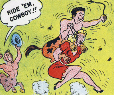
The sole example of his work printed in RAW featured Babe, a blonde, large-chested, hillbilly heroine who lives with her equally stereotypical hillbilly family. She goes in search of girls who have disappeared into a tunnel in the mountains. There she’s abducted by a race of centaurs, is used as a racing horse (the centaurs are the jockeys), and eventually escapes again.
There’s a plasticity to Rogers’ art that’s a large part of its appeal and that gives it its vigour. It’s not too far removed from the art in humorous comics from the same era, but there’s a perverse twist to its subject matter, with its not entirely wholesome emphasis on breasts and bottoms and women in bondage
You can see why this story would appeal to Spiegelman – the art isn’t too far removed from the likes of Wolverton as well as the underground cartoonists, it’s utterly surreal, and there are some none-too-healthy overtones in the sight of its heroine in near bondage, being ridden and whipped by a half-man, half animal. Its outré humour recalls MAD magazine too: it’s like seeing an entire alternative history of comics reprinted in a single sixteen-page story.
Had RAW continued, it would have been interesting to see what other examples of neglected comics art it could have uncovered. As it is, you can view it as preparing the way for those invaluable collections of past masters we now take for granted, as well as introducing us to less familiar names, who only now are receiving the attention they deserve.
Eight – life’s more interesting on the fringes
Towards the end of RAW‘s run, it devoted several pages to Henry Darger, who’s been called the Michelangelo of outsider art. Darger’s work, a mixture of collage and traced drawings, described the adventures of ‘The Vivien Girls’, Lucy Atwell-like figures who lead a rebellion against the inhabitants of a planet that enslaves and tortures its children.
There’s a point being made here: not only that the work has definite links with the comics world (many of the drawings originated in comics), but also that Darger was an artist who was ignored during his lifetime and considered at best eccentric, possibly mad. Now his work is critically appraised, and he’s become a hugely influential figure, especially in the counter-culture movement.
Look, Spiegelman is saying, here’s an artist who was rejected in his lifetime, but now is considered a genius of sorts. The parallels with the world of comics are all too obvious.
Many of RAW’s regular contributors could be considered to inherited this spirit of outsider art, but the two most prominent were Mark Beyer and Gary Panter.
Beyer, with his wilfully crude illustrations that evoke the flat, skewed worldview emerging in childrens’ drawings, has evolved an unlikely couple of angst-ridden heroes in Amy and Jordan, his best-known characters. The little vignettes that they and the rest of his characters inhabit are oblique, obsessed with death, despair and mutilation, but there’s a mordant wit in there that shifts many of the stories into the realms of black comedy. Beyer’s pages are held together by a strong sense of design, small, identical or almost-identical panels clustered together. In those panels, perspective varies, skewed so figures are too large, or too small, and there’s very little depth. Yet at the same time he communicates everything very clearly, even when faced with the complexities of an Alan Moore script (a rare cross-collaboration on Beyer’s part)
Beyer ‘s true antecedent of course was Rory Hayes, another artist who similarly was unable to draw in a traditional sense, and whose work was similarly filled with an existential dread.
Beyer is probably incapable of producing a traditional drawing (not that this matters). With Gary Panter you suspect that, like Picasso, he’s perfectly capable of drawing in a traditional sense. It’s just that he chooses not to.
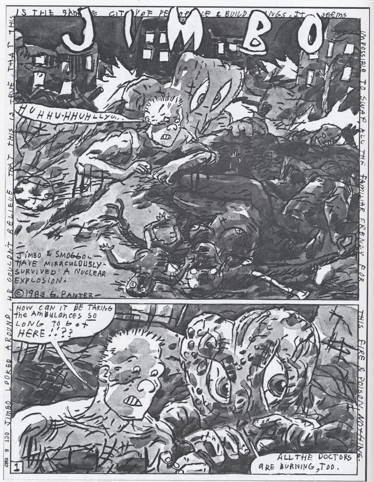
Panter’s own antihero is Jimbo, part noble savage, part naïf, who inhabits a world that may be a past or future wasteland. The storylines are slight, but the drawing is both primitive and incredibly complex. In the story printed in RAW 6, the landscape is unmistakeably one of a post nuclear holocaust. Jimbo and Sluggo (a sort of mutant side-kick) discover burning bodies, diseased corpses, strange blackened, dancing babies. Sluggo is found about to eat the burnt corpse of a woman. Jimbo goes a little crazy, and attacks Sluggo, who restrains him. “Don’t pay to judge me by human rules, because I am something else…you don’t have it bad. You’re literate buddy” advises Sluggo.
And that’s all there is.
Broken down this way, it’s nothing, less than nothing as a storyline. Taken in conjunction with the artwork, though, it takes on a grimy, but also almost spiritual quality. Coherence isn’t its primary goal. Panels fracture at moments of extreme emotion, so that figures peer out of them like magic eye paintings. The lettering used is crude, difficult to read and at times deliberately obscured. You can read a raw objectivism into the story’s conclusion, but the real magic is in the frenzied design, those strange, capering black dubs of figures, the oddly touching fragments of dialogue.“I’ll sing a song for you? Lady?” Sluggo says to a dying woman, with the disjointed, oddly distanced dialogue of a William Burroughs narrative.
Panter’s work, initially influenced by the likes of Savage Pencil, Pascal Doury and Bruno Richard, has transformed the landscape of comics. His vision is primitive, deliberately anarchic, and is one of ways in which the comics medium is developing. You have pre and post Panter, and his imitators are legion and multiplying.
Nine – Talent spotting
RAW’s hit rate when it came to spotting new talent was pretty much spot on. It missed out on Chester Brown and the Hernandez brothers, but it managed to give us examples of the work of virtually every other notable new talent emerging at the time.
Some made an immediate impact, most notably Charles Burns.
Burns is one of those figures that seem to appear out of nowhere, fully formed. Although the artwork, a twisted version of Herge with its hard lines and stark contrasts, is the most immediately impressive aspect (and surely the reason why Burns’ art instantly became in demand) it’s the storylines – lampoons of and/or hommages to 1950s science fiction and monster movies – that may prove to the most influential part of his work.
These are narratives reimagined with the benefit of hindsight, so themes always present become amplified, sometimes to parodic levels. In ‘The Voice of Walking Flesh’, vampiric creatures attach themselves to bodies. There are mad, obsessive scientists. The central character preserves and resurrects his wife’s severed head. There is a secret society who all wear fezzes. It’s a narrative that twists around its own love of cliché, with its Frankenstein’s monster parallels, but it investigates addiction, and obsession and control.
In ‘A Marriage Made in Hell’, the satiric elements are pushed even further, with its neat inversion in its depiction of a sexually frustrated newly-wed wife who lusts after her strangely reticent husband. Along the way there are further gender switches – the husband proves once to have been a woman, and the wife falls for her eventual rescuer, an outwardly prim and frumpy woman librarian. These are modern concerns, fixed to a deliberately archaic framework that emphasises and deconstructs their underlying themes.
RAW’s other great discovery was Chris Ware who, you might argue, kick-started the current boom in the literary graphic novel. The same concerns with form that have preoccupied him throughout his career are already on show here, along with his equally consistent concerns with slapstick humour.
Equally one could also mention Baru, or Richard Sala, or Kaz, or Jack Moriarty. There are very few of its contributors that didn’t go on to develop an impressive and significant career in the comics field.
Ten – you’re living in a world that RAW created
Since its demise, there have been many attempts to replicate the format and content of RAW. Snake Eyes. MOMA. Rubber Blankets. Blab. These have all had varying degrees of success, financially and artistically, but perhaps inevitably none have matched the standard and impact of the comic that served as their inspiration. When McSweeny’s produced their comics edition under Chris Wares’ editorship, it was only too obvious what comic they were modelling it on.
In retrospect, RAW’s legacy can be seen around us on many levels:
It created a less insular culture for comics. It’s no longer as USA-centric as it was, and the national origins, range and styles of comics available has increased dramatically. You can get manga, translations of obscure European comics, lavish reprints of past masters’ work, and low-circulation, highly experimental publications. And these days such things don’t seem remarkable: you take them for granted, as though it has always been this way.
It pushed forward the idea that comics have a history, and that to fully appreciate a comic, you need to know something about the medium’s history and how the comic you’re currently reading can be placed in that historical context. Some might argue this is a mixed blessing, but this is the way it is for any other art form as well.
It can be seen as a spawning ground, nearly 30 years later, for the “literary” graphic novel. Spiegelman won the Pulitzer Prize for Maus. Burns produced Black Hole, Chris Ware produced Jimmy Corrigan.
It’s helped create an entire small press culture where the emphasis was on more expensive limited-edition, unique works, a continuation of the die-cut and hand torn covers RAW was so fond of. This is a burgeoning silkscreen industry where exclusivity is everything. This is the legacy of the art end of RAW – the Panters and the Dourys and the Kiki Picassos. There’s a merging with art-gallery culture here, so some artists think nothing of producing their own little mini-comic, but then also displaying their art on the walls of a gallery. It’s part of an acceptance process, and you can see that too in the way that pages of original comics art are also appearing in galleries, and fetching prices roughly equivalent to the works of other contemporary artists.
Outwith the pages of mainstream publishers, virtually all of the big name, writers and artists around today came to prominence in the pages of RAW. There are very few exceptions I can think of (those few tended to be monopolised by Fantagraphics). This goes to show how influential it was, but also shows it’s followed the natural order. The upstart has become the establishment, and there’ll be a whole raft of artists and writers eager to overturn what it’s achieved with something very new, and very different. That hasn’t really happened yet. It’s a comic that’s thrown out a very, very long shadow.
One last thing. After giving you ten reasons why you should read RAW, here’s one good reason why you shouldn’t – RAW is long out of print and is very expensive to buy. Hopefully one day an enterprising publisher will collect and reprint all of the magazines, but in the meantime, you can get the Penguin editions, and the Penguin edition of Read Yourself Raw (collecting the best of issues 1-3) at very reasonable prices.
Excellent crash course, Pete. I especially liked having the appeal of Pascal Doury explained to me for the first time ever.
The complete RAW is probably (along with the collected Weirdo) the biggest outstanding comics-history gap in terms of current availability, but (re-)negotiating reprint rights to all the material would no doubt take ages to sort out. I treasure my Penguin editions, and in the meantime there’s less honest ways of tracking the material down. (As every music fan knows.)
The less honest ways are never quite as satisfying – I think it’s something to do with not being able to see the full page layout when you’re reading it. On the other had, if your only other option is to hunt down a copy of RAW #1 at £1000 a time…
great online fanzine. good to see articles by Mercy and Howard whom I know personally through Interlac. also great to see art spielgelman articles. My dad worked with Art at Topps, I talked to Art when my dad retired back in 1990. art was loooking for F-Tropp and Lost in Space cards
Good Luck Kevin McConnell
Thanks Pete. Certainly puts a lot of RAW’s legacy in perspective for me. A brilliant informative article, which kind of makes me wish I was about for /could afford RAW. Surely though, if this content was so quality, it should have been mass-reproduced for cheap access. Ohdear.
Keep an eye out on ebay – the Penguin editions can be picked up very reasonably there.
One of the less desirable legacies of RAW is that comics have become much more expensive generally, which kind of goes against the mass-produced, easily affordable ethos that the medium emerged from. It’s understandable though, when the sales figures of the lower-end mainstream books are struggling to hit even 5000 copies these days.
Fabulous posting bro. This important is just a tremendously nicely structured post, just the critical info I was looking just for. I praise you