I’ve seen that face before
by Tuomas Alho 14-Nov-10
Maybe the convention of drawing characters who exemplify Western body ideals also explains why many superhero comics are full of facial lookalikes? If the artists are expected to draw the characters to look physically ideal, they probably also make them correspond with Western ideals of beauty, which can be pretty narrow.
The clone syndrome in comic book art
When I first read the debut issue of Mark Waid’s and Barry Kitson’s Legion of Super-Heroes, I had a bit of a problem following the plot. It wasn’t Waid’s script that caused this problem, rather a particular aspect of Kitson’s art: he tends to draw characters that look very similar. The first issue starts with a scene where an unnamed teenage boy has a big fight with his parents about joining the Legion of Super-Heroes, after which he jumps out of the window. Rather than falling to his death, though, he activates a special flight ring given by the Legion, and flies away to become one of them. Later on we move to a scene where one of the new recruits to the Legion is introduced to everyone. The newbie is a kid who can turn himself invisible, and who looks like the fake suicide candidate from before. One might assume that this new kid is the window-jumping fellow, but on the other hand, maybe the first scene was just a stand-alone introduction to the series and the jumper was no one in particular? With some other artists we wouldn’t need to ask this question, but Kitson draws all the teenagers in the series (the Legion of Super-Heroes is exclusively a teen club) with the same physical characteristics, as if they’d come from the same clone family. The main distinguishing features between them are gender, skin colour, and hair.
Unfortunately several male characters in the Legion share a generic puffy “teenage hair”, so even that doesn’t always help. In a later issue we meet the invisible boy’s dad, who is indeed confirmed to be the guy from the beginning of issue #1. But even though this particular mystery was solved, it got me thinking about bigger questions: what’s the reason for this similarity of appearances? Is it a more common phenomenon than I had thought?
I don’t think Barry Kitson is a bad artist. He has a knack for composition, and he handles the sort of epic battle scenes Waid’s scripts calls for splendidly. And he’s hardly the only superhero penciller who draws characters that look alike, even if this tendency is particularly strong in his art. Is there possibly something in the superhero genre itself that would explain this “clone syndrome”? Anyone who has read more than one superhero comic is probably familiar with what some readers call “the most common superpower”: the fact that almost all superheroines have D cup breasts, if not larger. Even though there’s more variety among male superheroes, they too tend to have stereotypically “perfect” bodies. Maybe this convention of drawing characters who exemplify Western body ideals also explains why many superhero comics are full of facial lookalikes? If the artists are expected to draw the characters to look physically ideal, they probably also make them correspond with Western ideals of beauty, which can be pretty narrow.
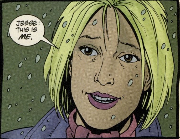
But it’s not only superhero comics where the clone syndrome can be found. Take Preacher by Garth Ennis and Steve Dillon, for example. Even though it has the same publisher as Legion of Super-Heroes, Preacher has a very different set of aesthetic ideals. The series is known for its gritty and violent storylines as well as for its vulgar, sometimes downright grotesque characters. Yet if we look at Steve Dillon’s art in Preacher, we can find the same phenomenon as in Legion of Super-Heroes. The main female character in the series is called Tulip, and we also get to meet her best friend Amy. Here’s how Dillon draws the two women:
 |
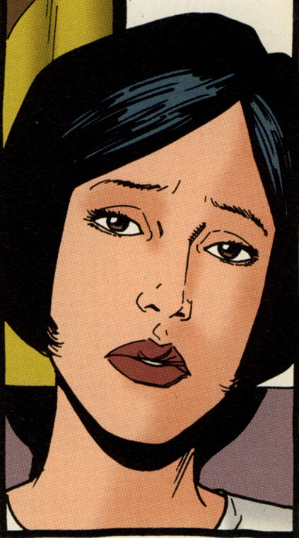 |
It’s a good thing Amy has dark hair, otherwise the poor reader might have serious trouble telling the two from each other.
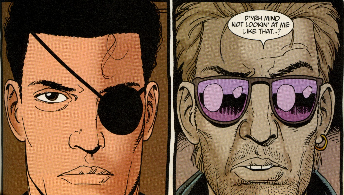
At this point you might think that the explanation to the clone syndrome is simple: straight male artists tend to draw women who they find attractive, and that’s why a particular comic is full of female characters who look like the artist’s ideal woman. No doubt this is partially true, but it isn’t the whole truth. Let’s take a look at the two male protagonists in Preacher, Jesse and Cassidy:
If you don’t count their various accessories, or Cassidy’s ghastly skin (he’s a vampire), they look pretty similar too: both have angular jaws, strong but not-too-big noses, somewhat sensual lips, symmetric faces in general. Clearly the case is not just Steve Dillon’s taste in women. Should we, then, deduce that Dillon can only draw one type of male and one type of female face? That isn’t quite the truth either. Let’s look at one more scene in Preacher, this one featuring none of the protagonists rather a bunch of incidental characters:
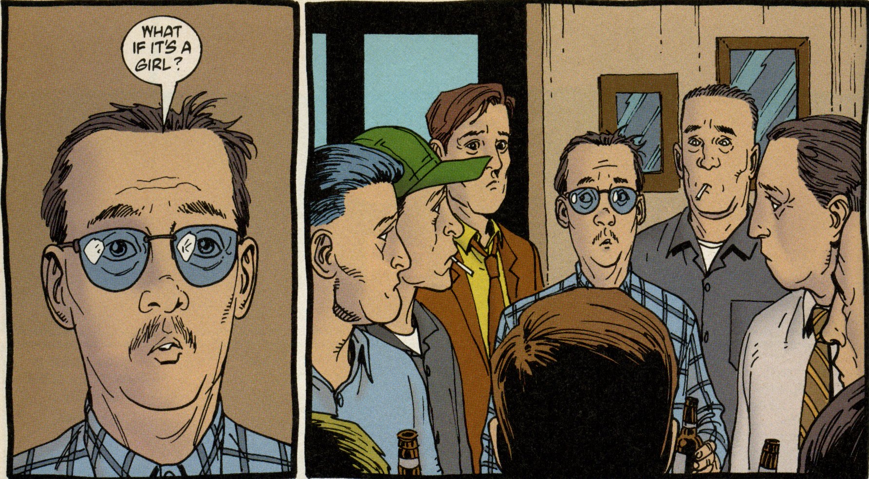
Here we can see that Dillon has no problem drawing a variety of face and body types, as long they belong to characters who are in a supporting role, and who are supposed to be a funny. They can afford to deviate from the norm.
Anyone familiar with manga knows that the clone syndrome is much more prominent there than in Western comics. The protagonists in Japanese comics usually have the big-eyed “manga look” that can make their faces almost indistinguishable from each other. What’s interesting, though, is that this unified look often doesn’t apply to the supporting characters. While the big-eye faces are supposed to make the main characters look appealing, the supporting cast are allowed to look imperfect, odd, or even ugly. This is supposed to emphasize their otherness, the fact that they’re not the protagonist, not the ones who we’re supposed to identify with. The same applies to many Western comics, such as Preacher. It’s a common cliché in both Western and Japanese fiction that beauty corresponds with goodness, whereas ugliness is often affiliated with evil or funny characters. The antagonist and the supporting characters can have a wide variety of physical imperfections. But when it comes to drawing the good guys, the ones we’re supposed to root for, it seems the options are more limited.
I’m not saying the idea that “good is beautiful” is the only explanation for the clone syndrome. The field of superhero comics is dominated by heterosexual men, both as creators and as consumers, so no doubt it’s often just a case of straight guys putting their dream girls on paper for other straight guys to ogle at. But men outside the superhero genre can be guilty of the same, as can female artists such as Pia Guerra or Wendy Pini. Of course, some people may draw characters that look alike as a matter of personal style, regardless of general aesthetic ideals. And some artists are simply so inept they’re unable to draw anything but the same type again and again.
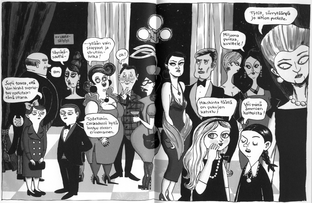
If the clone syndrome is a specific kind of visual trope, what can be gained from avoiding it? To illustrate the answer, let’s look at another example. This one comes from a Finnish comic book called Saniaislehdon salaisuudet (“The Secrets of Fern Grove”), written and drawn by Kati Närhi:
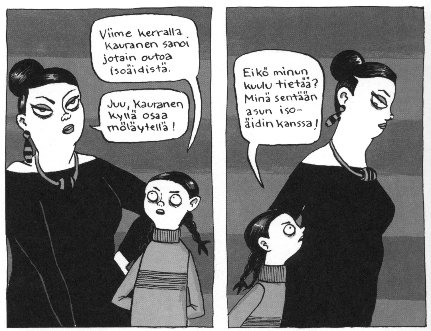
This splash page comes from a scene where the protagonist (the dark-haired little girl on the foreground), her best friend, and the friend’s mother go to the opera. As you can see, Närhi puts a lot of work in making her characters look distinct from each other. In fact, every character in the comic has her own unique facial features, her own body shape and dressing style. This isn’t something that’s absolutely necessitated by the plot. Unlike in Legion of Super-Heroes, there aren’t many similar characters in Saniaislehdon salaisuudet, so there’s no risk of confusing them with each other. However, making each character look unique can help the flow of the story in more subtle ways. For example, later in the comic the protagonist – who is an orphan living with her granny – meets a mysterious woman who claims to be her aunt:
It’s not hard for the reader to accept the supposed aunt is speaking the truth: she and the protagonist have similarly shaped eyes, noses and faces, suggesting that they are related. Saniaislehdon salaisuudet also features photos of the protagonist’s late mother taken in various stages of her life, and Närhi doesn’t need to point out they depict the same person, because she draws the mother with distinct facial features that are easy to recognize. Paradoxically, even though Närhi’s style is less realistic than Kitson’s or Dillon’s, the emphasis on the visual distinctiveness of characters makes them look more like living, breathing human beings than the protagonists in Preacher or Legion of Super-Heroes. You can of course say that Närhi’s cartoonish and exaggerated line makes it easier for her to design unique-looking characters. While this is true, that doesn’t mean artists with a more realistic style can’t do the same – the Steve Dillon panels above are a fine example of that.
Ultimately, what bothers me most about the clone syndrome is not that it can make plots harder to follow. It’s irritating when that happens, but it’s still quite rare. Most artists who draw the same face again and again are kind enough to give us other visual clues that help to tell characters from each other: hair, skin colour, accessories, clothing. Superheroes are usually easy to distinguish based on the colour codes in their uniforms. But if comics are supposed be a visual representation of our world, the clone syndrome can reduce the rich variety of people we see in real life to a dull and flat mannequin display.
Even though Hollywood movies are often accused of casting only beautiful people, at least they are limited to what kind of flesh-and-blood people exist in the actor pool. No such limits exist for the comic artist. Sadly, this lack of limits doesn’t always transfer to the sort of visual diversity you might expect. Especially when it comes to designing protagonists that are supposed to look appealing, the scope of possibilities can become very limited indeed. The clone syndrome could be seen as the ultimate expression of a uniform beauty standard. Since comic artists aren’t bound by the imperfections found in real people, they can make their characters look perfect. And if there’s only one ideal of beauty in our culture, that means these perfect people will be clones of each other.
It’s perfectly possible there are other explanations for the clone syndrome than the ones I outlined above. As I said, sometimes it can be a part of an artist’s personal aesthetic; some artists have such idiosyncratic styles that designing easily identifiable characters isn’t really a priority to them. But more often than not the syndrome is there because of cultural ideals, rigid genre conventions, or sheer laziness. Just as we criticize those artists who can’t draw proper perspective or anatomy, we should be critical of those who fail to portray the diversity of human appearance. That it’s easier to draw the same character again and again is no excuse.
Tags: Barry Kitson, Kati Narhi, Steve Dillon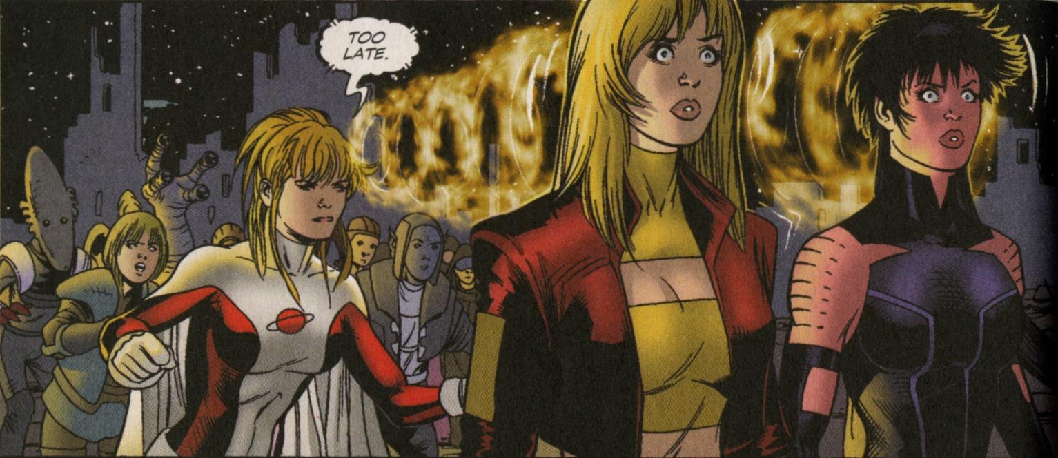
Nicely observed – the person that immediately came to mind in regard to identikit faces is Sal Buscema, but looking at his work again, he’s no worse an offender than the people you mention here. I suspect that for most artists it’s simply a crutch they use to meet their monthly deadlines.
Were Scott McCloud here, he would doubtless be raising his argument that protagonists have to have generalised, idealised looks so the reader can project themselves onto them.
You’re probably onto something with the “sheer laziness” thing, though!
I suspect that for most artists it’s simply a crutch they use to meet their monthly deadlines.
This might be true when it comes to minor characters, and I can totally understand cutting the corners when drawing those, but I don’t see why it should apply to main characters (like in my examples). Aren’t they supposed to be designed long before the series starts running?
Were Scott McCloud here, he would doubtless be raising his argument that protagonists have to have generalised, idealised looks so the reader can project themselves onto them.
As appealing as McCloud’s theory is, I’ve never really bought it. At least personally I relate much more to characters with idiosyncratic looks and personalities than with bland ciphers like Tintin. (I wonder if there are many people in the world who’d find Tintin easier to relate to than Captain Haddock?) They just feel more human to me. I guess a bland character works if you want to do “Choose Your Own Adventure” type of comic where the protagonist is literally a reader surrogate, but I assume most readers want their characters to be more “real”.
Tuomas:
I seem to remember that, in Preacher, Cassidy started out with a smaller chin and hollower cheeks, but before too long morphed into the “standard Steve Dillon face”, with just enough specifics to distinguish him from Jesse.
It’s a kind of shorthand, I think, and I agree with Peter it’s probably about meeting deadlines. To continue picking on Steve Dillon, his modern work is much more simply rendered than his early work, and he’s developed that simpler style, with a limited range of stock figures and faces for characters he draws all the time, for the sake of efficiency.
As for Tintin and Captain Haddock, I definitely identify with Haddock as an adult, but as a child I completely identified with Tintin. I think McCloud’s “masking” effect is much more prevalent in comics aimed at children.
Sorry Tuomas, your Kitson picture is very well chosen but your Preacher examples are just plain wrong. Tulip and Amy and/or Jesse and Cassidy look as different as, say, woman 5 from right and woman 2 from right, or child far left and child far right (aside from the hairstyle differences, these two are almost exactly the same face – to say nothing of the boy talking to the girl on the left who is identical).
You seem to be presenting only a two alternative option – that everything is cloned or all is cariacature – whereas the truth is far more complex. James Kochalka, for example, draws many men and women alike identically and are only distinguishable by hair and clothing, yet does he conform to your stereotyping? I hardly think so.
Look at Jesse and Cassidy’s ears – they’re identical!
Sorry, my references are to the Finnish splash you’re presenting as displaying the difference.
to say nothing of the boy talking to the girl on the left who is identical
I probably should’ve mentioned this in the text, but the reason they look identical is because they’re twins. Anyway, I choose the Närhi splash page because I thought it was a nice one-image example of an artist trying to do some varied appearances. Actually, all of the characters in the panel, except for the twins and the three characters in the lower right corner, are completely incidental, never to be seen after this panel. Like I said above, I find it more forgivable if an artist saves his time by not putting much effort to minor characters who appear only briefly, but it’s nice if the main characters have a distinct look. Artists like Närhi do this, but with Dillon it’s the completely opposite: minor characters have variety (because they don’t have to look good), whereas especially the major female characters tend to have a similar “pretty” face. Even the black deputy in the “Salvation” arc in Preacher looks pretty similar to Tulip, only with some African-American features. And Dillon’s Wolverine looks like a hairier version of Jesse, etc.
But you are right that there’s a lot of middle ground between opposites presented in the article. To illustrate my point, I specifically chose two artists (Kitson and Dillon) with a tendency to draw the same faces again and again, and it’s true that Kitson especially is a pretty extreme example of this. Of course there a lot of artists with a less clone-like style, but I still think the variety of faces (not to mention bodies) in most American mainstream comics (as well as manga) is much smaller than what it could/should be.
As for Kochalka, I’ve only read American Elf, but I’d say his art falls under different rules. His characters are too simplified and unrealistic to have any obvious position on an “ideal” – “idiosyncratic” continuum. I probably should’ve written more about this than what I said in the last paragraph of the article, but I’m not trying to form any unified theory of comic art here… Artists with a highly simplified and/or non-representative style tend to fall under a different set ot aesthetic principles than the ones I’m covering here.
Anyway, I think the pressure of monthly deadlines might be a partial reason why the clone syndrome is (in my opinion) less prevalent in European comics than in their US counterparts or manga (though obviously there are many Euro artists who draw clone characters as well), since the production time for Euro comics books is generally much longer. Though the European artists who’ve been hired to draw American mainstream comics have usually managed to hold on to their Euro style, so it’s also a matter of regional conventions in comic art.
Will’s X-Women review shows that Milo Manara is prone to this kind of problem, for women at least.
Hah, Manara was actually one of the examples I was thinking of when I said many Euro artists do this as well. Though I guess if you’re drawing porn or erotic comics, at least you have sort of an excuse, since you are actually drawing your dream women (or men). (Which doesn’t mean erotic comics can’t have variety too, props to Gilbert Hernandez for featuring different body types in Birdland.)
It’s been years since I’ve read the two “serious” comic books Manara did with Hugo Pratt, I can’t remember whether he drew the women in them any differently than in his erotic work.
Not significantly, to the best of my recollection.
The Kati Närhi artwork is splendid, by the way.
I just wish Steve Dillon would get OFF PUNISHER MAX BY JASON AARON!!! He’s ruining it with his horrible art, i just wish Goran Parlov would return on Punisher Max, he’s awesome and PERFECT for the Punisher. Guy also knows how to draw the guns (realistic guns,etc).
Never noticed the similarity between Tulip and Amy before; they’re like Betty and Veronica.
Great article! For that reason, I love the work of David Aja on Hawkeye. Only a few traits he shows us a variety of characters, each with their own expressions.